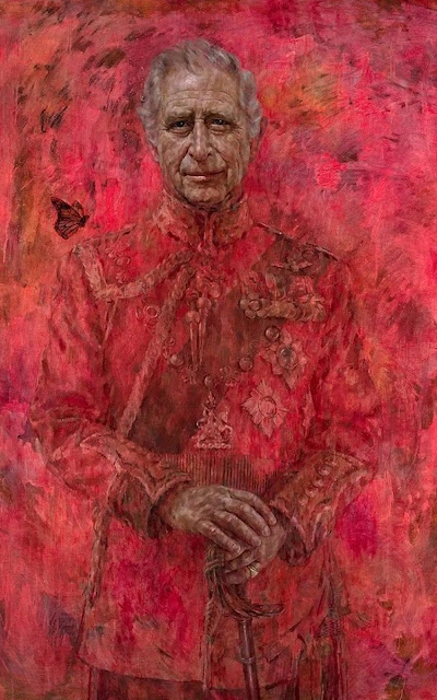
I think it’s brilliant!
Very vivid and engaging. Artistic and beautiful.
I like the atmosphere of the painting, but it’s HRH’s face that is most absorbing. It grows on you.
I think his face has the faint lineaments of a smile, but I also sense some melancholy or pathos.
Alastair Sooke has written that the portrait reveals “a vulnerability the late Queen was rarely allowed”. He “isn’t entirely sure of himself”. I don't think he is uncertain or anxious. But the heaviness of the eyebrows, the kindly wrinkles, and the narrowness of the eyes hint at some kind of sadness.


It's a remarkable likeness of the King. But what's the point of the bright red background?
ReplyDeleteHello Nick.
DeleteSo, in my view, it's worth asking whether you really "need" a "background" at all. Most portraitures involve some basic abstractions ... even as far back as Botticelli's Portrait of a Youth.
https://upload.wikimedia.org/wikipedia/commons/0/0c/Sandro_Botticelli%2C_Portrait_of_a_Youth%2C_c._1482-1485%2C_NGA_21.jpg
Picasso's self-portrait positions himself against some abstract background which is quite beautiful and that focuses the mind on the subject
https://www.boredpanda.com/blog/wp-content/uploads/2016/02/pablo-picasso-self-portraits-chronology-7.jpg
Van gogh didn't actually look anything like the little speckles in which he painted himself anymore than his background.
https://36.media.tumblr.com/8282b2fc04a2c3484f2fa2a6979fb1b9/tumblr_o4vpjogXOH1s0u653o1_1280.jpg
I checked Jonathan Yeo's portrait of Tony Blair. It's v. similar to Charles. The red/maroon colour may be inspired by HRH's miliary garb?
https://www.jonathanyeo.com/cara-1-68
Wow -Christine cmlk79.blogspot.com
ReplyDeleteI don't think the Charles in the painting resembles the one I usually see in the Media. However, it's quite am impressive piece of art!
ReplyDeleteyeah, it's quite nice .. isn't it.
DeleteIt looks like he is immersed in the hellfire.
ReplyDeleteIt's a reasonable likeness but the immersion in red/pink does nothing to improve it.
ReplyDeleteIt captures his face beautifully and I like the idea of a butterfly. Many do not know or at least mock King Charles 11 for his green ideas. Of the articles written by him in a green magazine he seems genuine. The red is a bit off putting but then it makes you focus on his face.
ReplyDeleteHe is a sensitive, very human soul. I have always liked him.
ReplyDeleteWith my colour vision, I would not know about the red if it had not been mentioned.
I think the artist has caught Charles face so well ... but I'm not keen on all the red surround.
ReplyDeleteAll the best Jan
I missed this post so commenting now.
ReplyDeleteI love this, it's different from the normal portraits. The likeness is great and that smirk on his face is typical of photos and videos I've seen from afar.