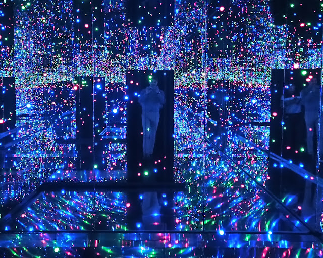
On Monday 17th July, I visited the Yayoi Kusama exhibition at the Tate Modern.
I had never heard of this artist; but I have since been shocked to see just how much of a big-deal she is in the art world: 'Japan's greatest living artist' etc.
She has been subject to an interesting and favourable BBC profile recently.
✲✲✲
Chandelier of Grief
The first partition in which guests are expected to queue and enter is a darkened room. The door is then promptly closed behind you. Mirrors surrounding you, and it takes some time to adjust to darkness. At first, I was disoriented slightly, and then - at head-height - is suspended a chandelier in the darkened enclosure.
According to the Tate, it is "intended to create a destabilising yet mesmerising effect" and be evocative of "mourning" and loss.
I was disappointed and underwhelmed. The whole thing is lame (tickets £10 per person). The chandelier seems tacky; a cheap-and-cheerful ornament. The visual arrangement is supposed to be reminiscent of some baroque-style affectation, and so presumably candleholders ought have held real candles - and not those electric light-bulb cheap substitutes. I think the shifting and dancing glow of a flickering candlelight - against the blackness - would have engendered a more stirring response.
At any rate, and despite the overall flatness, I think this annoys me in a more fundamental way. The problem here is the lack of artistic proficiency compounded by the prevailing notion of the subjectivity of art (currently leaning on the idea that art should be objective). The viewer is expected to do the heavy-lifting. They are expected to stand there, survey the arrangement, rearrange the pieces, make sense of it, and then emote.
So, this kind of installation strikes me as lazy. It's just a mirror-walled room with some random rubbish suspended. People are too easily impressed, and I honestly think most spectators are kidding themselves at the Tate. We know from the placebo effect that humans are apt to convince themselves that something has had more of a positive effect on them than it actually has. The viewer approaches some talked-about art, and then rationalises some meta placebo-ish explanation; and - because art is purportedly subjective - people think their unfeigned feelings must validate the force of the installation. You could suspend a dead chicken and people would still find it 'moving'.
It doesn't help that we were herded into the instillment and then back out: within 2 mins max. Sad.
✲✲✲
Infinity Mirrored Room – Filled with the Brilliance of Life
This is fun, and it did excite me when I first entered; but that's as complementary as I can be (oh, and that's me with the Hitler moustache). I have to admit there were cool and fun mirrors, lights and decorations - but not much beyond that. I don't think this should be regarded as art.
While doing some research for this blog, I came across a post online about this exhibition. I was struck by a comment in which a visitor talked about it giving them an "insight into seeing inside the Milky Way, the great eternal...". This kind of talk returns me to my above point: I think it is too easy for any artist to create such an installation and then expect the viewer to do the abstract metaphysical weightlifting.
This isn't really some avant-garde or futuristic exploration of life or space. It's just a bunch of mirrors which create an illusory disorienting feeling - which is fleeting; and the beautiful multi-coloured dazzling effect. Otherwise any hedged-maze would be considered art too. So it was fun initially; but it relies on cheap fleeting thrills to mask an essentially vapid superficial empty concept that could be applied to any other thing. It's meant to sound deep but it's not. Nobody should think Kusama's work at the Tate has anything transcendental or profound.
Also – I hate the conveyor-belt feel of this exhibition at the Tate. Art should be personal; and this is anything but.
✲✲✲
The rest
So far, I have not personally come across her other works, so I may stand corrected; but - from what I have seen - they consist almost entirely of an obsession with random polka dots, phallic boats etc. Not art on a high level: more the level of graphic design. The fact that Andy Warhol was accused of ripping off her ideas is itself very revealing because I don't think Warhol's work constitutes much beyond fake and imitation, and little originality.
The BBC article goes through her difficult life backstory. But having obstacles and difficulties in life says nothing about the quality of the artistic production. Her work seems easily recognisable and very superficial (like Damien Hirst).


No comments:
Post a Comment