I recently went to the "Hilma af Klint & Piet Mondrian: Forms Of Life" exhibition at the Tate Modern. I found it a really interesting journey into abstraction, and provided insights into Mondrian's work in particular.
For me, I think Mondrian's abstractions are more interesting. I find af Klint's mysticism and spiritualism act as a barrier for me to really engage with her work. I think she's a fascinating lady, and I think she must have shocked and touched people with her esoteric radicalism.
It seems neither af Klint nor Mondrian knew one another (or their work), but this exhibition does suggest that share a common thread in their development of abstract art, moving away from the convention of representation.
During their lifetimes, they experienced the breaking of so many new technological frontiers. All of which challenged human perception - e.g. microscopy, radiography, photography etc. The existence of invisible worlds to the human eye (in science) also touches on af Klint's spirituality. For me, this exhibition delves perhaps too much into their spiritual beliefs - but it does form their approaches to perceiving the world. Indeed, their abstraction is a means of understanding the world.
This analysis/review is in 6 parts (with separate post for Klint's finale in the exhibition).


✲✲✲
Part 1 - Incipiency
Hilma af Klint (born 1862) and Piet Mondrian (born 1872) started off their careers as traditional classical landscape painters in the late 19th century.
- The Academy of Fine Arts in Stockholm had only begun to accept women to study in 1864. In 1882, af Klint joined them. While studying, she became well known for her landscape and portrait paintings, establishing herself as a respected artist.
- Mondrian was associated with the 'Hague School' of realist painters in the second half of the 19th century and their focus on muted colours, loose brushwork and textured surfaces.
Lake scene by af Klint

Quite a pretty painting by af Klint.
A sunset scene. Some heavy daubs on the skyline for clouds and the setting sunshine. The painting does have shiny veneer - perhaps the atmospheric sunset?.
✲✲✲
Spring Landscape from Lomma Bay by Klint

✲✲✲
Evening Landscape with Cows by Mondrian

One of the problems with this painting, for me, is the fact that you can feel the texture of the canvass through the painting. Otherwise, it is also a charming arcadian vista with a few cows.
✲✲✲
Haystack Behind a Row of Willows by Mondrian

Quite a pretty painting.
I do love this type of heavy brushwork, scrapping through the impasto. Feels expressionistic, and can be quite evocative of a summery, windy feel - even natural.
✲✲✲
The Gein: Trees Along the Water by Mondrian

I also like this.
There's obvious skill through the beauty of nature with the sky-pink sunset which illuminates the skyline and is reflected in the unruffled river water.
✲✲✲
Geinrust Farm in the Haze by Mondrian

✲✲✲
Part 2 - Evolution
This second part of the exhibition explores the spiritual and artistic evolution of both artists.
In their 'Evolution' works, they both experimented with symbolism through their choice of motif, colour and form.
✲✲✲
Dune Landscape by Mondrian

In this painting (and the following 2), the landscape (which Mondrian was classically trained in) has been broken down into its constituent shapes and colours, and flat planes analogous of the Post-Impressionists.
✲✲✲
Sea After Sunset by Mondrian

✲✲✲
Dune III by Mondrian

✲✲✲
Evolution by Mondrian

Here Mondrian gives us a triptych panel of a goddess. The middle face reminds me of an Ancient Egyptian goddess. It has that classic Egyptian spatial and linear geometric forms of statutes in design and decoration. She also seems to be the only one with eyes open, and behind her a radiant sunshine.
I think it is interesting; but I can't say I like this too much. Once again, I think you have to embrace the underlying 'philosophy';
According to the Tate:
Mondrian wrote of this painting: ‘It’s not so bad, but I’m not there yet.’ The figures represent the stages in evolution from the physical to the spiritual realm, as promoted in Theosophy. The triangular nipples and navels of the women, which point upwards and downwards, symbolise their spiritual and earthly orientation. The central figure embodies the fulfilment of the evolutionary process, to the spiritual realm. The flowers on the left panel are symbols of purity, while those on the right symbolise tragic suffering.
This is part of Mondrian's (above-mentioned) shift towards a more graphic geometric style, with distinct lines and bold colours; imbued with symbology.
✲✲✲
Lighthouse at Westkapelle by Mondrian

This lighthouse is quite lovely and sits next to his 'Evolution'.
Among its pastel-colours and loose tones, the lighthouse is defined by its (apparent) straight lines and flat horizontal strokes of colour.
It shows how Mondrian is shifting in his art.
✲✲✲
Dune IV by Mondrian

l do like this Dune- very much; and it's very interesting.
I wonder if we can discern the faint outlines of his latter grid?
✲✲✲
The Red Cloud by Mondrian

Another interesting one.
This painting doesn't have the same feel as Mondrian's earlier landscapes. It looks almost incomplete with patches of the canvass empty.
According to the Tate:
The clearly visible brushstrokes reveal the painter's hand, implying a quick oil sketch. A pencil drawing, probably a preliminary sketch, suggests that Mondrian painted the picture in his studio. The work shows the fleeting moment when a cloud is coloured red by the setting sun, which is either hanging low in the sky or has just vanished behind the horizon.

✲✲✲
The Evolution series by af Klint
Af Klint's work here is also called 'Evolution'. It bears some 16 panels along a wall.
I think there is a pattern in the colour choices of black, light pink leading to blues, and strong oranges. Then, there is religious symbolism (the cross), venerable geometry, good and evil. In some of the paintings, I wonder if af Klint painted the anatomy of the uterus. Snail shells are a recurring theme. Some of the art work resemble life as it would appear under the microscope.
There is some language, but every painting seems to bear some aspect of life, birth and death.


✲✲✲
Part 3 - Metamorphosis
In this part of the exhibition, the focus is on each artists's observation of nature to depict flowers.
I think I preferred Mondrian here. I think af Klint was rather limited to the requirements of the botanical paintings of her day (mind you, they're still pretty).
✲✲✲
Golden-Banded Lily by Mondrian

Beautiful.
Mondrian was mostly drawing and painting single flowers. He would paint the bloom and wilt of the flowers as a way of tracing natural processes over time.
✲✲✲
Red Amaryllis with Blue by Mondrian

✲✲✲
Botanical paintings by af Klint

These botanical watercolours (on paper) are wonderful.
According to the Tate, during the 19th century, botanical illustrations were one of the few professional artistic avenues open to women. Af Klint became skilled in this area.
Her botanical drawings deserve a blog of their own, as they are so life-like and so pretty.
✲✲✲
Evening: The Red Tree by Mondrian - 1908

This painting is arresting and very interesting.
The intense red and blue of this tree is meant to capture the vision just before nightfall. In this painting, Mondrian painted a tree as a 'plastic expression' with such warm energetic brushwork for the branches.
I think we can see how Mondrian's former realism is morphing into some abstraction. The earthy tones of his earlier Dutch landscapes have given way to more expressive and saturated hues. It seems he took inspiration from the impressionists, Fauvists, Vincent van Gogh's paintings (Mondrian visited his exhibition in 1905 in Amsterdam), and the spiritualist movements (i.e. the above-mentioned Theosophy).
✲✲✲
The Blue Tree by Mondrian - 1908

A more abstract version of the above painting - but, in my view, not nearly as striking or soul-stirring.
✲✲✲
Flowering Apple Tree by Mondrian - 1912

According to the Tate, after travelling to Paris in 1911, Mondrian encountered cubism.
Cubism must have a huge shock for him. It offered a totally new and radical approach to emphasizing the two-dimensional surface of a canvass (by breaking an object into distinct planes).
We can also see how the trunk and branches are being condensed to a series of verticals and horizontals. Mondrian seems to be condensing the tree to its essential qualities. Perhaps even a hint of his forthcoming rectilinear arrangements ?
There is an interesting quote above this painting (which speaks to his object in art):
"Nature or, that which I see, inspires me, puts me, as with any painter, in an emotional state so that an urge comes about to make something, but I want to come as close as possible to the truth and abstract everything from that..." Piet Mondrian, 1914
✲✲✲
The Tree of Knowledge by af Klint


Very interesting, and these paintings confirm af Klint was a deep thinker.
They were part of a series (from 1913 to 1915) entitled "The Tree of Knowledge". Af Klint returns to the theme of the beginning of the world from a slightly-biblical (though still mystical) perspective. Mind you, the existence of a tree does tend to feature in most religious traditions and ancient mythology.
She became interested in spiritualism as a young lady. She was a member of a close-knit group of lady, 'The Five'; and she regularly took part in seances and started painting heavenly visions and schemes. From a historical perspective, they may be the earliest abstract paintings.
These paintings are very interesting, detailed and ornate - and quite scientific with their symmetry. There is usually a central tree, with curved lines, and colour palettes and motif drawn from nature. There are arrows and forces being depicted.
They are interesting and make you think - but I don't find them very alluring or deeply moving.
✲✲✲
Part 4 - Dynamic colours (Mondrian)
In this section, the exhibition looks at the way both artists experimented with form and colour to express the 'universal'.
- Mondrian gradually refined his depictions of the towers/sea views etc. until dissolved into complete abstraction
- He saw verticals as the 'male principle' (representing spiritual), and horizontal as expressing the 'female' (material principle).
- Mondrian's ultimate goal was to "plastically" express a universal harmony based on balance of oppositional forces.
✲✲✲
Composition with Grid 9: Checkerboard Composition with Bright Colours by Mondrian - 1919

I think this is a bit more complicated than it seems.
Here Mondrian gives us a regular grid but with irregularities in the primary and neutral colours (not his later more intense & vivid pure primary hues).
According to Mondrian:
The great struggle for artists is the annihilation of static equilibrium in their paintings through continuous oppositions (contrasts) among the means of expression.
The above quote relates to the subtle asymmetrical balance that was being sought in Mondrian's oeuvre, and is an early example of the De Stijl style.
De Stijl was born in Holland. During WWI, Holland maintained its neutrality; and, during which, a clutch of Dutch artists were able to consolidate an art movement with a pervasive influence on the Western world. It took its name from a journal De Stijl (The Style) which was published in 1917 till 1932. Piet Mondrian and Theo van Doesburg were its 'leaders'. Mondrian was the most articulate advocate for its underlying philosophy (which he preferred to call neoplasticism). In short, it was opposed to the ascendant individualism and subjectivity of the Romanticism onwards. It was supposed to give way to a classical collaborative art with a universal comprehensible frame of reference. They hoped to create a coherent style of environments for all aspects of life. The commitment to abstraction involved a reduction of form via a strict grammar of flat surfaces, straight lines and right angles. Colour reduced to the 3 primaries (red, yellow, blue) and the neutrals (white, black and grey). These essentials were symbolic of life, and reflected an inherent ideal unity and harmony of the universe. So, the 3 primary colours were supposed to embrace the range of emotions, and the vertical was the active while the horizontal was the passive.
A lot of this is resonant with his spiritualism too. Indeed, for me, quite cryptically, Mondrian wrote:
"Once we realize that equilibrated relationships in society signify what is just, then we shall realize that in art, likewise, the demands of life press forward when the spirit of age is ready."
Also, on close inspection, you can see the delicate brushstrokes:
 |
| The lines are not as perfectly edged as they appear from afar. |
✲✲✲
Composition No 3 with Colour Planes by Mondrian - 1917

Interesting that there are no black lines of varying thickness in this canvass.
Just blocks of light-colour floating on a white background. As I understand, the black lines tend to refer or demarcate the physicality of nature (e.g. tree etc.), thus the overall effect is the evaporation of depth.
Is there a harmonious or precise balance to the canvass? Perhaps. I think so. Or it doesn't seem to have an imbalance, per se.
✲✲✲
Composition in Colour B by Mondrian - 1917

Another interesting one. Some black lines, but larger white background.
Is there a harmony? I guess so, and there is something inherently beautiful about the composition. More, I think, that the checkerboard above.
 |
| Interesting brushwork. |
✲✲✲
Composition in Line, Second State by Mondrian - 1916

For me, I don't think this painting is beautiful. It reminds me of a metropolis. But I think I need some colour.
I think this may be too abstract. Let me explain. De Stijl was a kind of spiritualist quasi-religious movement which held that humanity progresses from the physical (natural) to the spiritual (abstract). Thus, for Mondrian, the use of abstraction - colours, lines, the surrounding shapes - is supposed to represent the spiritual (or universal) itself. So, he sought to take art into the rarefied domains of pure intellectual abstraction (as opposed to the emotional and individualistic depictions of the natural world). Indeed, in the late 1910s, Mondrian made several visits to New York as he was into Jazz. He said that New York City was an abstract life given form; "in the metropolis, beauty is expressed more mathematically."
I think the above quote may be the problem. It's perhaps too mathematical. To my mind, the problem with these sort of art is that it can be so abstract that it tends towards non-art (i.e. it begins to collapse on itself).
✲✲✲
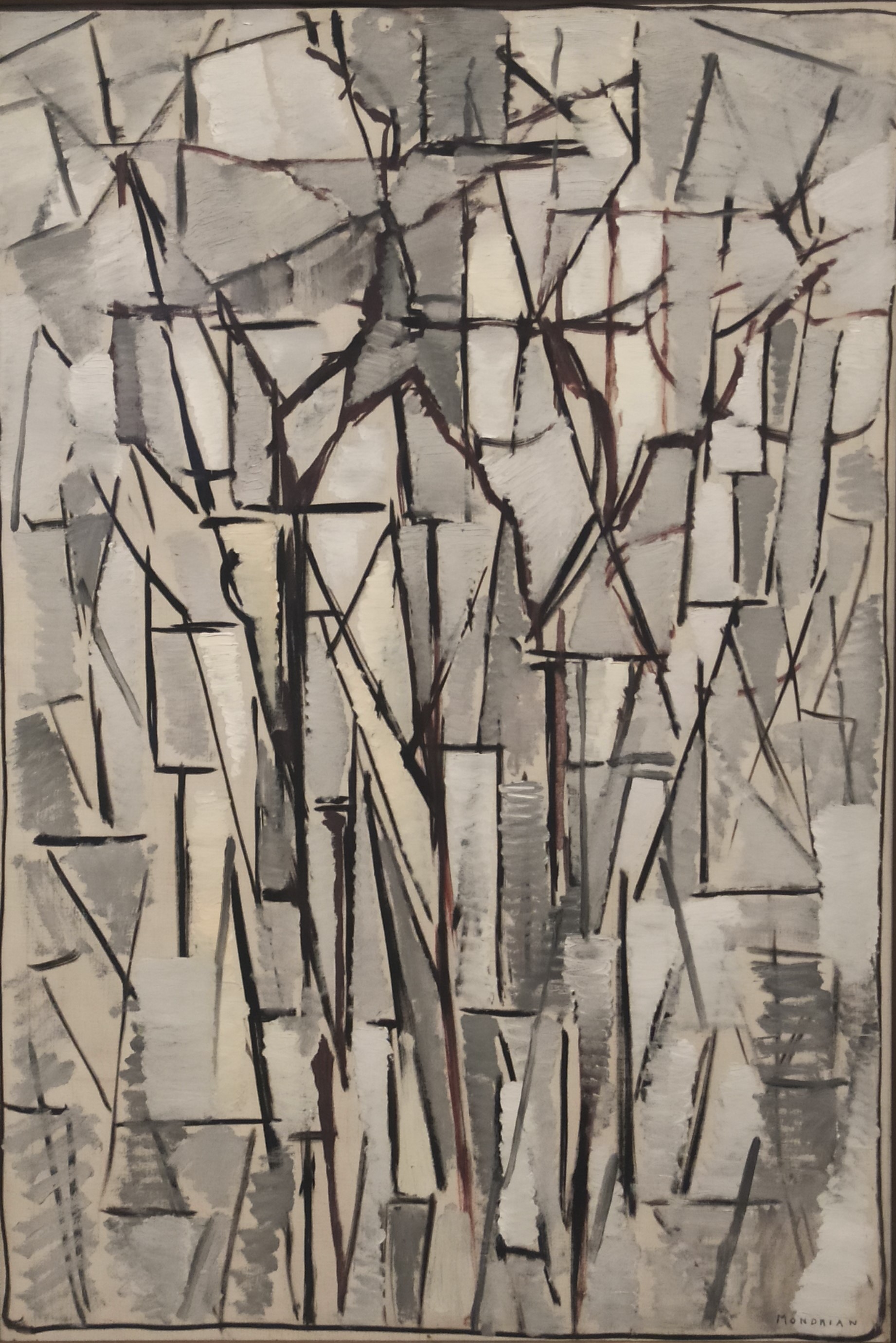
Composition in Oval with Colour Areas II by Mondrian - 1914

In 1911, Mondrian established himself in Paris and was influenced by cubists Picasso and Braque. Thus, Mondrian made a series of artwork with that sort of analytical cubism.
This canvas is comprised of interweaving planes and in vivid contrasting tones (with that earthy orange and brown). It's interesting that the lines are not perfectly horizontal (the passive) but looks like plenty of vertical straight lines.
It's quite pretty and engaging.
 |
| It's clear Mondrian was painting intuitively without planning. Areas, it seems, were made painted over. |
✲✲✲
Part 5 - Old geometries (af Klint)
These paintings below seem to be about some invisible 4th spacial dimension (Theosophy) which largely disappeared as a 'movement' after Einstein's theory of relativity. Af Klint used geometry in her search for "primordial images".
For me, I don't really buy into her philosophical message; and so it doesn't evoke quite as much for me. It's a shame that so much of these abstractions are necessarily intertwined with her mysticism. To my mind, once the mysticism crumbles, the power of her art doesn't seem to have the same eclat.
✲✲✲
The Swan series by af Klint - 1915

Interesting. I think I remember seeing this as a child somewhere.
This dates back to 1914 - when she was living in Stockholm - during WWI. The two swans kissing or fighting. Everything rendered in opposite. The world upside down?
Across the series below, we see figurative imagery and abstract forms. Organic tendrils and spirals overlaid with symbolic geometric.
✲✲✲

As above, this is interesting, and I suppose quite radical for its time.
It reminds me of some viscous liquid in a boiling flask. Quite scientific.
✲✲✲


As above, I do like the richer maroon red against the black. Quite engrossing even.
✲✲✲

Once again, quite interesting. Af Klint is obsessed with snail shells! :) .
✲✲✲


I adore this cute little house and the golden sun ball. So lovely.
✲✲✲
Part 6 - Space and Rhythm (Mondrian)
From 1914 onwards, Mondrian wanted to bring space alive through horizontal and vertical lines, and primary colours and grey white and blocks. By 1920, he developed his neoplasticism of irregular grids for simplicity and his "dynamic equilibrium" to explain how a composition is produced through spatial relationships of lines and colour planes.
To Mondrian, neoplasticism was the pictorial language representing a universal art form. For me, I wonder if Mondrian's art reflected his environment. He started off painting pastoral scenes. When he moved to Paris, his art had begun to reflect the more urban architecture and lifestyle. His paintings acquired even more movement and energetic action when he moved to New York (as per his Broadway Boogie Woogie painting). So, for him, perhaps the vector of his artwork was a reflection of the transformations of his environment in which he lived.
My favourites are the bottom 2.
✲✲✲
Composition with Red, Black, Yellow, Blue and Grey by Mondrian

✲✲✲
Composition with Grid 3: Lozenge Composition with Grey Lines by Mondrian - 1918
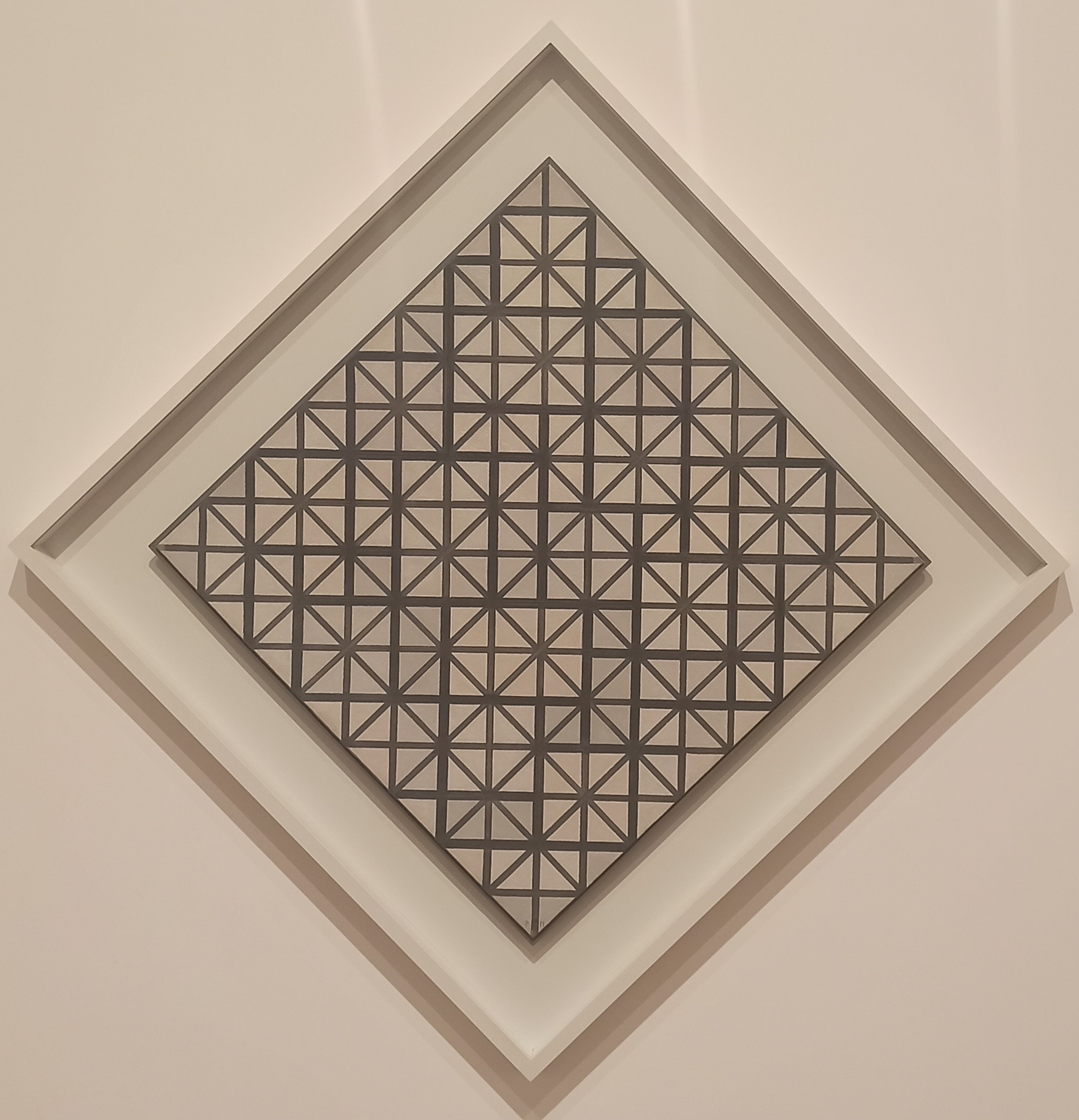
The contrast between the thick grey lines and white background can create a shimmering feel if you look in the middle.
Quite pretty.
✲✲✲
Composition with Red, Black, Yellow, Blue and Grey by Mondrian - 1921

It's ok, nice. But I don't feel there is the same peaceful harmony as the last few.
Perhaps too much colour and action?
✲✲✲
Composition 8 (No.II) with Red - 1935

Nice. I quite like it. It feels like the sun is shining.
That large red square grabs the attention immediately. Then, the eyes scan through the rest of the painting and finds harmonious proportions of the different squares. I think this is how the asymmetry permits the painting to appear balanced.
I think the lack of a contrasting colour is counter-balanced by the proportionate squares which makes it aesthetically pleasing.
✲✲✲
Composition with Lines and Colour III - 1937

I think this might be my favourite.
The blue in the middle feels like a lake. The eyes are drawn to that square. Then, we notice clockwise the long and very thin vertical lines. Perhaps trees?
The layout of the remaining grids seem to divide half-way to form some skyline.
✲✲✲
Composition with Yellow, Blue and Red - 1937

Quite pretty.
As above, I think of a deconstruction of a sun, a lake with trees, and a house.
✲✲✲
Mondrian's abstraction
I really enjoyed the below paintings grouped together.
They show Mondrian's transition from realistic representations to organic experimentation with various forms in seeking new ways to represent nature.
Very clever of the Tate.

✲✲✲


I so wanted to see this exhibition, Liam, but we just did not get the time to go to London. So, it was good reading your post. I know Mondrian's work quite well but had never seen any of af Klint's work. I was at first struck by some of the similarities, Spring and Evening Landscape, for instance, could have been made by the same artist. I liked the Evolution and Metamorphosis series and I loved the Old Geometries section. As you say,the last four paintings of Mondrian's grouped together is very clever of the Tate, fascinating and so revealing of how artists work and progress.
ReplyDeleteWhen I read the bit about how Mondrian saw the vertical as the male principle, i.e. spiritual and the horizontal as the female, i.e. as material, I did not know whether to yawn or groan or just scream in frustration. There we go again, the old rubbish of men being the spiritual, the intellectual, whereas women are just of material things: just not clever enough, not really understanding the higher things in life. Arghhhh!!!!
But, thank you for this post. It made up for not seeing the exhibition.
Hello Eirene,
DeleteThanks for commenting.
Yes, I didn't myself get the spiritual/earthly contrast either. I assumed the horizontal and vertical was a reference to the ancient phallic (greek word?) symbols. Problem is that both of them infused so much mystical guff into it their works; that I think we have to overlook as part of their foibles.